
What Should I Invest In?
In my last post, I discussed several factors to consider when starting to build an investment system and provided a couple examples as starting points.
Those starting points were:
1. S&P 500
2. 60/40 portfolio
In this post, I am going to go into more detail on these two examples.
Two popular investment options are the S&P 500 and the 60/40 portfolio. The S&P 500 represents the largest 500 companies in the United States. It is a good proxy for the stock market. The 60/40 portfolio is a mix of 60% stocks and 40% bonds. Both of these options are common benchmarks which professional investors use to judge their performance.
Return Paths
Let’s look at the return paths in the below chart. The blue line is the S&P 500 index. The orange line is the Barclays Aggregate Bond index. The green line is 60% S&P 500 and 40% Barclays Aggregate Bond index, rebalanced monthly.
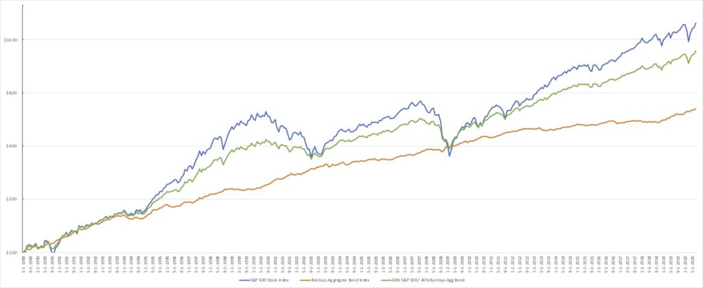
You can see that the S&P 500 (blue line) has performed the best over the last thirty years or so. The path to those returns was also the bumpiest, with bigger relative swings up and down along the way. If you were selecting the S&P 500 as part of your investment system, you would have to be okay with taking on more risk and be comfortable with the drawdowns the come along with this investment.
On the flip side, you can see the Aggregate Bond index (orange line) has returned the least over this time period. However, the return path for bonds was much more stable and steady along the way. If this risk level works better for your goals or comfort level, that is good to consider when building your system.
Finally, the 60/40 portfolio (green line) performed somewhere in the middle. You would expect this because this portfolio is created with parts of the other two examples. The 60/40 portfolio allows the investor to participate in gains from the stock market, but also help protect against the downside. This compromise might feel better to some investors.
The trick is thinking about your level of comfort with different risk levels before investing your money. If you know what to expect and have a plan, it will help you stay disciplined in your investment system.
Drawdown
Another way to gauge your risk level is to look at historical drawdown for each investment. Drawdown is measured as the percentage change from the peak (high point) to the trough (low point) during a given period. The chart below can help you understand how each investment has performed in the past.
Would you be able to maintain your investment plan if you experienced a drawdown of 50%, as seen in the S&P 500 (blue line) in 2008. If the answer is no, then you would likely be more successful starting with a portfolio with less exposure to stocks. You can see the 60/40 portfolio (green line), for example, only experienced roughly a 30% drawdown during 2008. And the bond index (orange line) was the most stable by far.
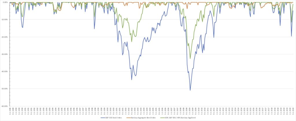
Analyzing return path and drawdown for these investments can help you find the right mix of stocks and bonds for you investment system. Knowing what to expect and determining your comfort level before you invest will allow you to stay disciplined when following your plan.
If you have any questions or if I can help in any way, please let me know at [email protected].
If you found this helpful, please considering sharing with others. Thanks!
Jason
Very well written for everyone to understand!